이제까지 배운 내용을 바탕으로 새롭게 2일차 과제의 코드를 리뷰하고 리팩토링 해보았다.
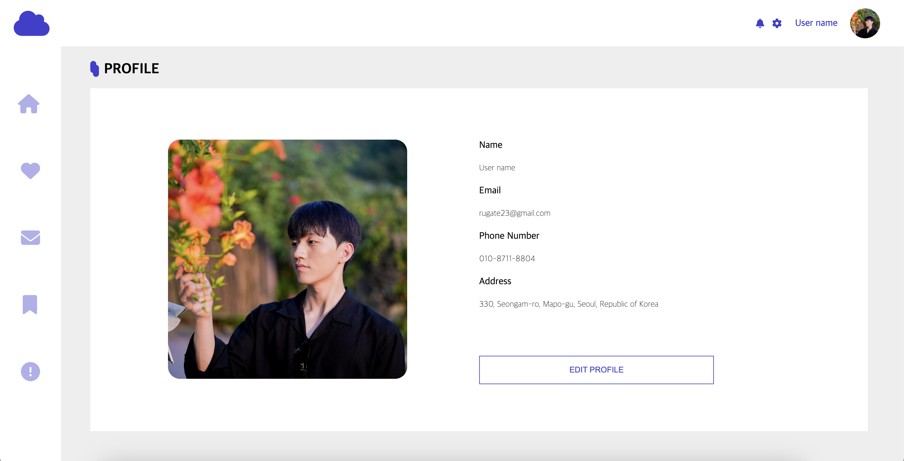
1. 가로형 상단 네비게이션 바 리팩토링
#cloud-logo {
    float: left;
    color: #413FD0;
    margin-left: 25px;
    margin-top: 5px;
}
nav > *{
    text-align: end;
    float: right;
    margin-right: 25px;
    margin-top: 25px;
    color: #B0AFEB;
}
nav p {
    color:#413FD0;
    font-weight: 500;
    font-size: 16px;
    text-align: center;
    margin-top: 25px;
}
nav img {
    width: 50px;
    height: 50px;
    border-radius: 100%;
    object-fit: cover;
    margin-top: 10px;
    margin-bottom: 20px;
}
중복 코드가 많고 float과 margin을 사용했던 것을 볼 수 있다. float을 사용하는 것도 좋지만 position을 사용해서 조금 더 코드를 유연하게 만들고 보기 편하게 만들도록 하였다.
nav {
    padding: 10px;
    width: 100%;
    height: 10vh;
    position: relative;
}
nav > *{
    color:#413FD0;
    position: absolute;
    top: 50%;
    transform: translate(-50%, -50%);
}
#cloud-logo {
    left: 3.5%;
}
nav p {
    font-weight: 500;
    font-size: 16px;
    text-align: center;
    right: 5%;
}
nav i:nth-of-type(2) {
    right: 13%;
}
nav i:nth-of-type(3) {
    right: 15%;
}
nav img {
    width: 50px;
    height: 50px;
    border-radius: 100%;
    object-fit: cover;
    right: 1%;
}
2. 세로형 사이드바 및 본문 코드 리팩토링
}

.sidebar i {
    width: 8%;
    display: block;
    color: #B0AFEB;
    margin: 80px 30px;
}

.sidebar i:nth-of-type(2) {
    margin: 80px 35px;
}
.sidebar i:nth-of-type(3) {
    margin: 80px 35px;
}
.sidebar i:nth-of-type(4) {
    margin: 80px 38px;
}
.sidebar i:nth-of-type(5) {
    margin: 80px 35px;
}

.container {
    background-color: lightgray;
    width: 100%;
    height: 100vh;
}
article article.sidebar {
    background-color: white;
    height: calc(100vh - 100px);
    position: fixed;
}

.container {
    background-color: #eee;
    width: 100%;
    height: calc(100vh - 100px);
    position: relative;
}
.content {
    position: absolute;
    left: 10%;
    top: 10%;
    width: 86%;
    height: 82%;
    background-color: white;
}

.diagram {
    position: absolute;
    left: 10%;
    top: 3.5%;
    border-radius: 30px;
    background-color: #413FD0;
    width: 10px;
    height: 20px;
}
.diagram2 {
    position: absolute;
    left: 10.3%;
    top: 4.4%;
    border-radius: 30px;
    background-color: #413FD0;
    width: 10px;
    height: 20px;
}
사이드바 코드 또한 중복 코드가 많고 순서 정리가 되어 있지 않아 보기가 불편한 것을 볼 수 있다. 사이드바에 position을 fixed로 위치를 고정시켜 사이드바를 만들었지만, 이번에는 absolute로 설정해보았다.
.container {
    background-color: #eee;
    width: 100%;
    height: 90vh;
    position: relative;
}
article .sidebar {
    background-color: white;
    height: 90vh;
    position: absolute;

}
.sidebar i {
    width: 8%;
    display: block;
}
.sidebar i:nth-of-type(1) {
    margin: 80px 30px;
}
.sidebar i:nth-of-type(2) {
    margin: 80px 35px;
}
.sidebar i:nth-of-type(3) {
    margin: 80px 35px;
}
.sidebar i:nth-of-type(4) {
    margin: 80px 38px;
}
.sidebar i:nth-of-type(5) {
    margin: 80px 35px;
}
본문 전체를 90vh로 할당한 이유는 상단 네비게이션바가 10vh로 할당했기 때문에 두 요소의 합이 100vh로 되도록 하여. 전체화면을 채웠다.
'Today I Learned > CSS' 카테고리의 다른 글
| [CSS] CSS 4 - 에이블런 프론트엔드부트캠프 5일차 (0) | 2024.07.19 |
|---|---|
| [CSS] Loading bar - 에이블런 프론트엔드부트캠프 5일차 (0) | 2024.07.19 |
| [CSS] CSS 속성 2.5 - 에이블런 프론트엔드부트캠프 4일차 (0) | 2024.07.18 |
| [CSS] CSS 속성 3 - 에이블런 프론트엔드부트캠프 3일차 (1) | 2024.07.17 |
| [CSS] CSS 속성 2 - 에이블런 프론트엔드 부트캠프 2일차 (0) | 2024.07.16 |

